Redesign of an existing website for the Digital Design degree at Metropolia UAS
Role
UI-designer, Facilitator, Graphic Designer
Content
Website redesign, Visual Identity, Graphic Design
Year
2023
Summary
Tasked with redesigning the Digital Design degree’s website and creating new visual brand elements, we benchmarked competitors, aiming for a unique refresh. A dark theme and distinct accent colors were early design choices. Recognizing a common weakness in student portfolios, we prioritized showcasing students and their design processes. Analysis and user testing of earlier designs revealed usability and accessibility issues, informing new wireframes and layouts. I created a mood board, guiding my UI design. Palette, typography, and layouts were iteratively improved based on client feedback. Wireframes and layouts were user tested. I also contributed to student interviews, identifying core values. The project delivered a refreshed visual identity, redesigned website, and new brand elements. Technical implementation was completed, but deployment was outside the project scope. This project allowed me to fully utilize my UX/UI skills, design conceptually and more creatively (a welcome contrast to commercial work), and refresh my service design skills.
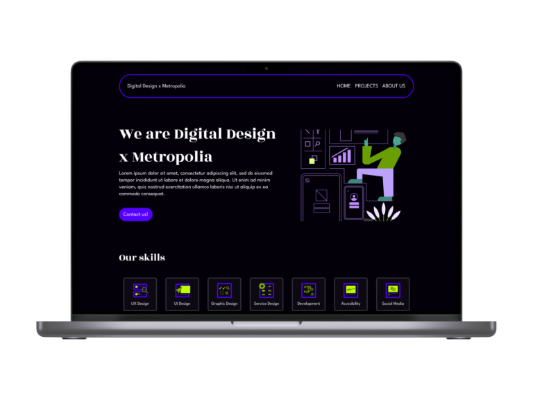
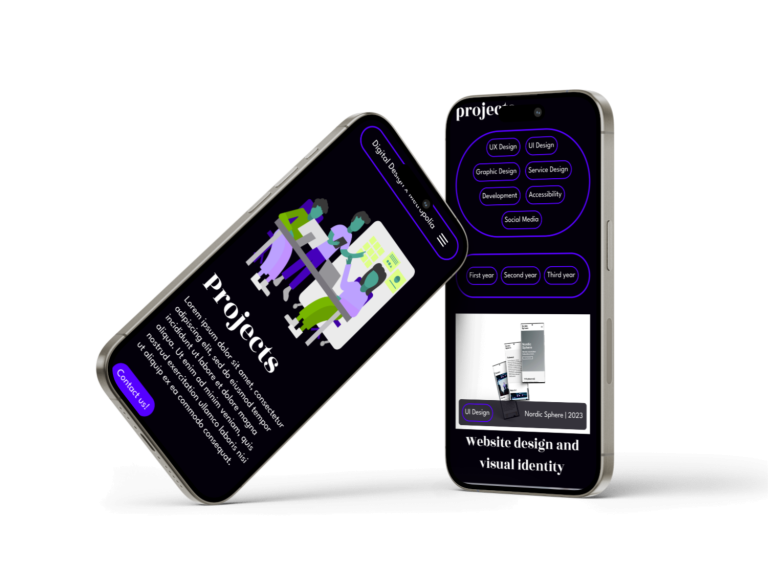
We were tasked with redesigning and technically implementing a new version of an existing website for the Digital Design degree at Metropolia UAS. We were also tasked with designing new visual brand elements.
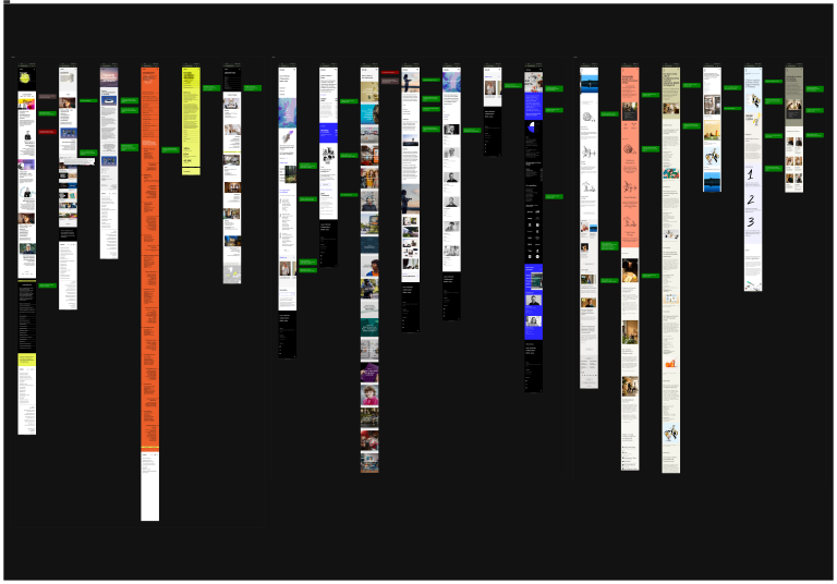
We started the process by benchmarking competitors to find inspiration and understand what should be on the new layout of the website. The client’s wish to have a unique and refreshed design guided us with the benchmarking.
The dark theme and unique accent colors were small design decisions that made the design stand out from the start. On top of that the results of the benchmarking had also shown us that a lot of the Digital Design degree programme portfolios did not really highlight the students or the design processes and main principles. We wanted to keep these things in mind and really highlight them in the new designs.
Me (UI) and my teammate (UX) found problems during in the earlier designs in our analysis and user-testing of them. These usability and accessibility problems were taken into account while designing the new wireframes and layouts.
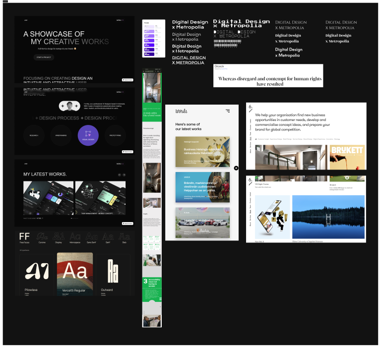
Next I created a mood board from the benchmarking findings in order to find possible directions the visual could go towards. As an UI Designer in this project I kept these things in mind while designing the wireframes and layouts.
The palette, typography and layouts went through commenting rounds with the client and improved versions were made based on these comments. I created wireframes and me and our UX Designer tested them in order to validate the design decisions and further improve the designs. When the final versions of the visuals and wireframes were picked I designed the website layouts and some of final the graphics.
Me and our UX Designer user tested the layouts in order to validate the design decisions and further improve the designs.
On top of this I was also one of the people in our team who interviewed our students in order to find the values and principles that our Digital Design degree student’s feel best describe us.
We crafted the new refreshed visual identity and redesigned the website. We designed new visual brand elements that complemented the refreshed look. Technical implementation was completed, but due to timeline limitations the new version could not yet be pushed to the live website within the limits of out project scope.
During this project I could truly utilize UX/UI Design skills to the fullest. A big bonus was that this project allowed me to design in a more conceptual and creative way. It was a really nice contrast since that is something most commercial projects do not really allow. There were a lot of service design methods involved which meant that I could freshen up my skills on that front too.
Sorry, currently unavailable for new work!